Pictographs Worksheets
About These 15 Worksheets
Pictographs are one of the friendliest ways to introduce kids to data-they swap boring numbers for fun pictures, turning math into something instantly understandable. These worksheets are packed with smiley faces, seashells, burgers, fruit, and more, so kids can practice counting, comparing, and analyzing information without even realizing they’re “doing math.” Each page is designed to help learners see the relationship between symbols and quantities, which is the foundation of data literacy. With pictures that look more like story illustrations than math problems, pictographs quickly become one of those “aha!” moments for students.
This collection gives children plenty of practice reading, creating, and interpreting pictographs. Some worksheets present ready-made graphs for kids to study and answer questions about, while others encourage them to build their own pictographs with icons provided. That combination of observation and creation helps cement the concept of how visual data works. And the food themes, toys, and beachy designs make sure kids stay entertained while learning.
The real beauty of pictographs is how easily they connect to real life. Kids will start noticing them in books, infographics, and even simple charts at home or in the grocery store. They’ll learn that data isn’t just abstract-it’s about tracking things they love, like snacks, toys, or sports. These worksheets lay the groundwork for interpreting information in a world full of charts and visuals, giving students a skill set that feels practical and empowering.
Have a Look Inside Each Worksheet
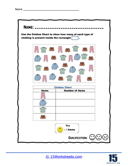
Happy Face Pictograph
Students use cheerful smiley-face icons to represent data-maybe showing how many students are feeling happy, sad, or excited. This makes abstract numbers relatable through expressive symbols. It encourages emotional engagement while teaching data interpretation. A bright, uplifting entry point into understanding pictographs.
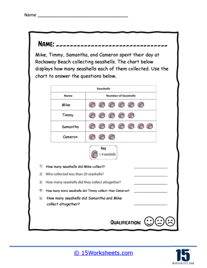
Seashell Chart
This worksheet likely shows seashell images to represent counts-perhaps for beach-themed surveys like favorite shells or how many found. It combines charm and context for data reading by connecting ocean items with numbers. Learners practice counting and visual comparison in a beachy setting. A relaxed, seaside spin on data basics.
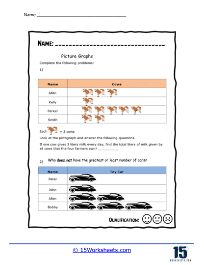
Cow and Car Picture Graphs
Here, cute icons of cows and cars are used to represent quantities-ideal for comparing farm vs. transport themes or preferences. It combines contrasting topics to help kids practice category comparison. Matching image to number supports early analytical skills. A quirky mix that keeps data reading interesting.
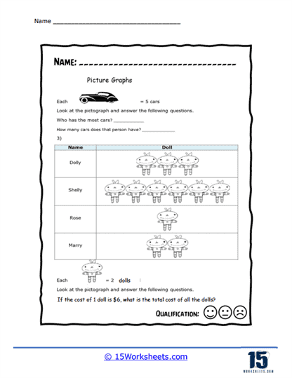
Page 2 Cars and Dolls
This follow-up worksheet features cars and dolls in pictograph form-students might answer questions like which category has more or how many in each. The toy-versus-vehicle twist engages different interests in the same activity. It reinforces category comparison and scale usage. A playful extension that supports observational thinking.
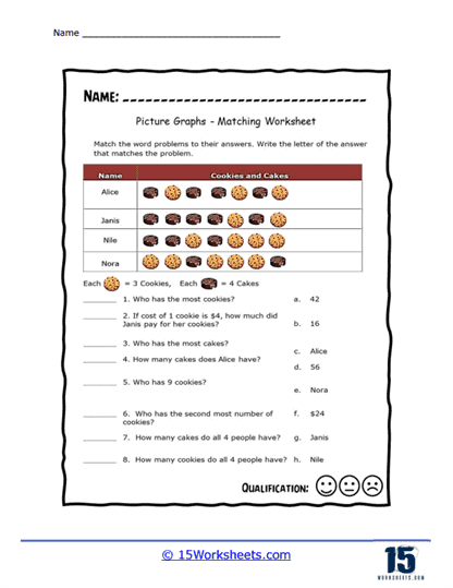
Cookies and Cake Picture Graph
Students count and compare cookies and cake icons-perhaps plotting favorites or snack popularity. It’s a sweet setup that links food visuals with data practice. Learners reinforce interpreting quantities and reading scales in a tasty context. A dessert-inspired worksheet that’s as engaging as it is educational.
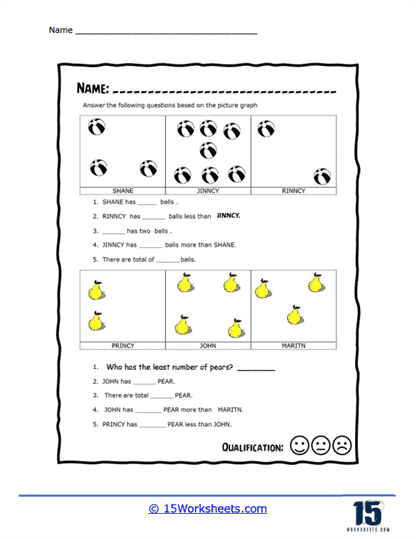
Beachballs and Pears Diagram
Fun visuals of beachballs and pears allow students to interpret data-maybe tracking preferences or quantities of items found. The contrasting shapes make comparison clear and playful. Counting and comparing categories become visually intuitive. A fresh, summery twist on visual representation.
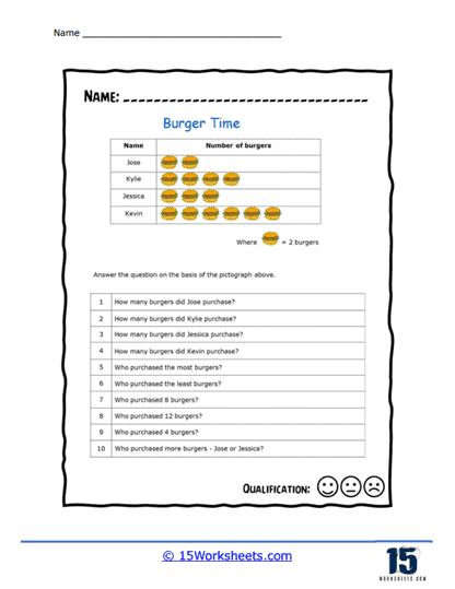
Burger Time Data Chart
Burger illustrations likely stand in for quantities-kids might chart favorite toppings or count burger types. It uses a fun food metaphor to make data approachable and memorable. Students practice reading pictographs while relating to everyday favorites. A hearty, mouthwatering introduction to data charts.
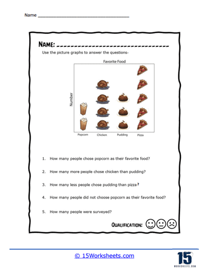
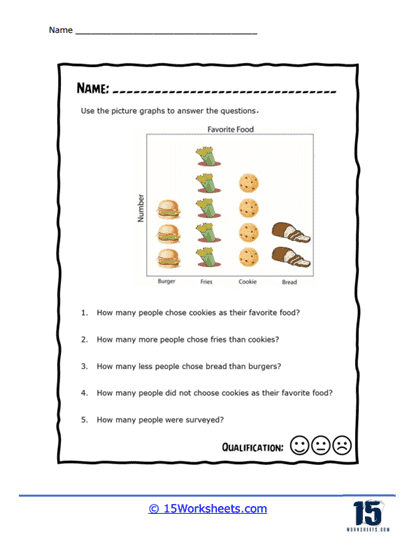
Favorite Food Picture Graph
This worksheet invites students to graph their favorite foods using icons-transforming personal preference data into visuals. It encourages self-expression as well as data skills. Learners practice interpreting and drawing pictographs in context. A yummy, individualized takeaway on representation.
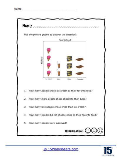
More Food Pictographs
A continuation of food-themed graphing-students use various food icons to read and compare data points. The expanded variety adds complexity while staying thematic. It helps reinforce category comparison and scale consistency. A buffet-style feast of data visuals.
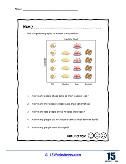
More Food Questions
This sheet poses questions based on food pictographs-e.g., “How many more apples than bananas?” or “Which is the least picked?” Students must interpret and think critically about the presented data. It deepens comprehension through inquiry. A thoughtful follow-up that turns visuals into reasoning practice.
Breakfast and Dessert
Icons of breakfast items vs. desserts are used for comparison or counting-like cereal bowls or cupcakes-to read simple data stories. It teaches contrast and preference through familiar meals. This helps students relate everyday routines to data analysis. A deliciously thematic way to learn visual interpretation.
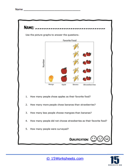
Fruits Pictograph
Various fruit icons-apples, bananas, grapes-represent quantities for students to read and interpret. It reinforces category understanding through colorful, healthy visuals. Learners practice counting, comparing, and summarizing data. A fresh, fruity take on picture graphs.
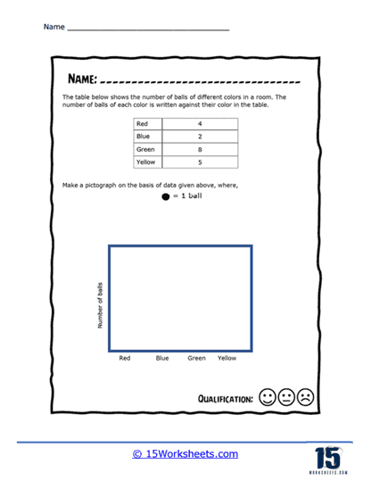
Create a Ball Pictograph
Students are likely asked to build their own pictograph using ball icons-for example, recording how many of each they have or choose. It turns passive interpretation into active creation, deepening understanding of pictograph construction. Learners deposit meaning by placing images in context. A sporty canvas for visual data-making.
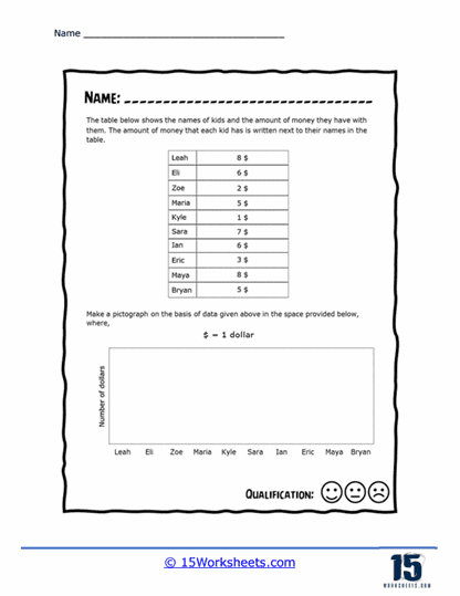
Money Picture Graph
Money-related symbols (coins or dollars) chart values-perfect for tracking or comparing amounts in a graph format. It links pictographs with early financial literacy and visual counting. Students refine scale and symbol understanding. A practical, monetary twist on picture-based data.
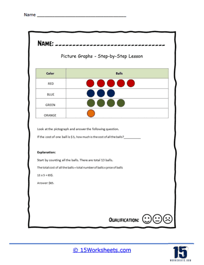
Simple Pictograph Lesson
An introductory worksheet designed to explain the key parts of a pictograph-like title, legend, symbols, and scale-before diving into interpretation. It lays the groundwork for all subsequent activities. Definitions and examples help build a strong conceptual base. A clear, structured start to pictograph learning.
What Are Pictographs?
Pictographs, also known as pictograms or pictorial charts, are a type of graphical representation used to display data using images or symbols to represent quantities. In a pictograph, each symbol or image represents a specific number of units or a fixed ratio of the total data. The symbols are arranged in a chart format to convey information about the data in an easy-to-understand visual format.
Pictographs are particularly useful for presenting simple data in a visually engaging and intuitive way, making them suitable for audiences that may have difficulty interpreting more complex graphical representations, such as children or those with limited numeracy skills. They are often used to display qualitative or categorical data, where the focus is on comparing the relative sizes of different categories.
It’s important to note that pictographs have some limitations when it comes to representing complex or large datasets, as they can be less precise and more challenging to interpret than other graphical representations like bar graphs or line graphs. However, when used appropriately, pictographs can be an effective way to convey simple data in a visually engaging and accessible manner.
Introducing Them To Students
Introducing students to pictographs can be a fun and engaging way to teach data visualization and basic math concepts. Here are some steps and tips to help you introduce pictographs to students:
Start Simple – Begin by showing students simple examples of pictographs that represent familiar objects or concepts. This will help them grasp the basic idea of using pictures or symbols to represent data.
Focus on Key Components – Describe the essential elements of a pictograph, such as the title, the symbols or images used, the key or legend, and the axes (if applicable). Explain how each component contributes to conveying the information in the pictograph.
The Concept of Scale – Explain to students that each symbol in a pictograph represents a specific number of units or a fixed ratio of the total data. Ensure they understand the importance of using a consistent scale for all symbols in a pictograph.
Discuss What They Mean – Teach students how to read and interpret pictographs by comparing the sizes of different categories or groups represented by the symbols. Encourage them to draw conclusions or make inferences based on the data presented.
Hands-on Activities – Provide hands-on activities that allow students to create their own simple pictographs using data from real-life situations or from their own interests. This could include representing their favorite fruits, sports, or the number of books they have read in a month.
Incorporate Technology – Introduce students to digital tools or software that can be used to create pictographs. This will help them develop digital literacy skills and make the process of creating pictographs more interactive and engaging.
Compare with Other Graph Types – As students become more comfortable with pictographs, it’s helpful to introduce them to other types of graphs, such as bar graphs, line graphs, and pie charts. This also creates a natural step toward graphing on coordinate planes, where data is placed using numbers and positions instead of pictures. By comparing these different graph types, students begin to understand when each one is most useful and how data can be shown in more detailed and precise ways.
Use Varied Examples – Show students a range of different pictographs, both simple and more complex, to help them develop their ability to interpret and analyze data presented in this format.
By incorporating these steps and tips into your lessons, you can effectively introduce students to pictographs and help them develop valuable data visualization and math skills.