Line Graphs Worksheets


About These 15 Worksheets
Line graphs are like storybooks for numbers-they take plain old data and turn it into a clear, visual journey. Instead of just staring at a list of numbers, students can actually see when things go up, down, or stay the same. That’s what makes this worksheet set so powerful: it helps kids realize that graphs are more than lines on paper; they’re pictures of real events.
This collection uses fun, everyday themes-ice cream, candy, balloons, fish, even giraffes-to keep the math playful and relatable. Some worksheets ask kids to build their own graphs, while others have them read and interpret graphs that are already drawn. This mix makes sure they’re not just drawing lines, but actually understanding the story those lines are telling.
These worksheets also prepare students for real-world data skills. Whether it’s following a weather report, checking sports stats, or looking at sales trends, line graphs show up everywhere. As students get comfortable reading and drawing these graphs, they also begin learning about plotting points on quadrants, where data is placed on a grid to show exact positions. By practicing here, students gain a strong foundation for more advanced graphing skills they’ll use in school, science, and beyond.
Have a Look Inside Each Worksheet
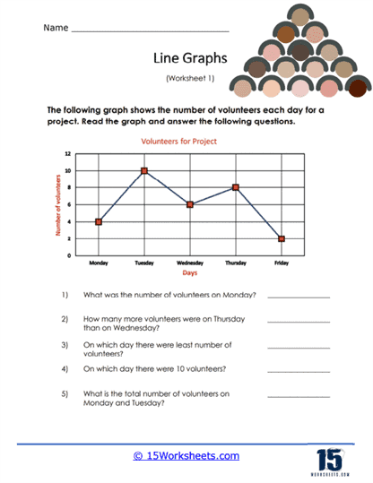
Volunteer Line Graph
This worksheet invites students to plot and analyze volunteer hours over time, transforming numbers into visual stories. They get practice reading data trends, spotting peaks and dips in helping hours. It’s a real-world context that shows how everyday actions can be measured and compared. It helps them build graph-reading skills while feeling good about community involvement.
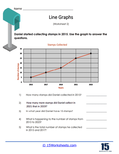
Daniel’s Stamps
Here, learners track Daniel’s stamp collection over time by creating or interpreting a line graph. It turns what could be just numbers into a fun personal story-collecting stamps grows, and so does graph fluency. Kids practice plotting points and connecting them to see how something builds. It reinforces reading growth patterns and matching data to visuals.
Toys Sold
Students analyze the number of toys sold each week by plotting a line graph. They’ll read trends-maybe sales dip around holidays or boom during birthdays. It’s practical, immediately relatable, and helps them link data with real-life timelines. It supports understanding of cause and effect through numbers and visual trends.
Making an Ice Cream Line Graph
This worksheet focuses on building a line graph that displays ice cream sales or flavors over time. It spirals in a delicious theme that keeps students interested while they chart data. They practice axis labeling, plotting points, and drawing trend lines-all with a scoop of fun. It teaches that graphs can tell tasty stories too.
Student Population Graph
Here, learners examine how class or school population changes over months or years via line graph. It gives real-life context-watching their school grow or shrink visually. Students interpret the peaks and plateaus and compare timelines. It helps them understand demographic shifts through simple data.
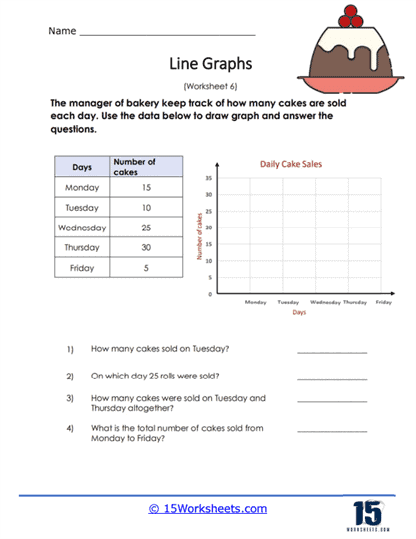
Cake Sales Data
Students use line graphs to display cake sales over time-maybe daily or weekly. This baking-themed activity helps mix sweetness with skillful plotting. They practice reading rises and falls in sales, learning about trends in a tasty format. It makes data analysis feel like part of a yummy story.
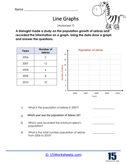
Making a Zebra Line Graph
This unique worksheet probably portrays the growth or stripe counts of a zebra, plotted over time. It’s playful, creative, and helps students make sense of data in a wild way. They’ll plot data points and follow the zebra’s story through shifting lines. It reinforces graphing with a twist of animal fun.
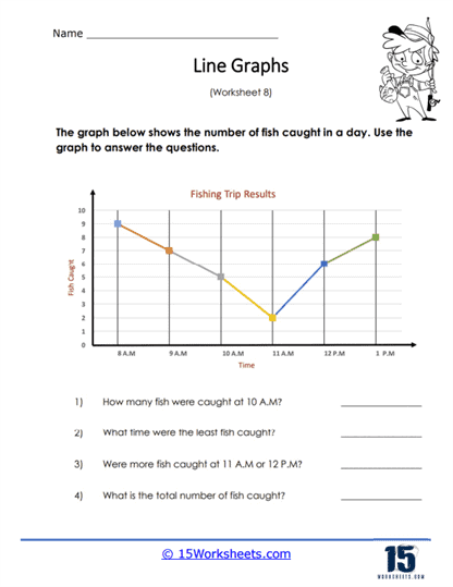
Catching Fish Graph
Learners track fish caught over successive days or trips using a line graph. It ties in nature and measurement-who caught more, when, and how patterns emerge. Students get to visualize patience, effort, and result through plotted lines. It’s a great way to weave real-life adventure into data skills.
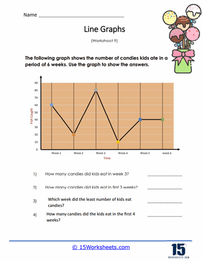
6 Weeks of Candy
This worksheet has students chart their candy intake or types over six weeks on a line graph. It’s bright, predictable, and easy for them to see patterns-like sugar highs after Halloween. They practice steady plotting and trend spotting in a sweet scenario. It reinforces how time-series graphs reveal habits over time.
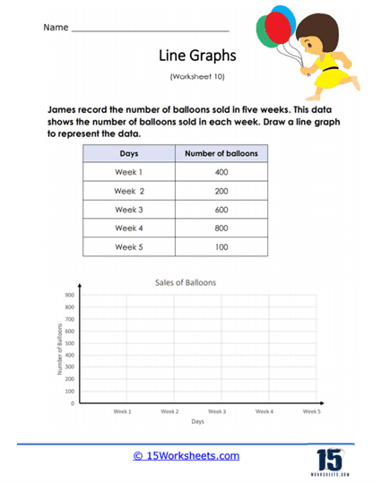
Make a Balloon Sales Graph
Here, students plot balloon sales over time, building a line graph as they go. It may feature dips after holidays or mid-sale slumps that they need to interpret. The theme keeps it colorful and festive while sharpening graph skills. It teaches that data has shape, just like balloons do.
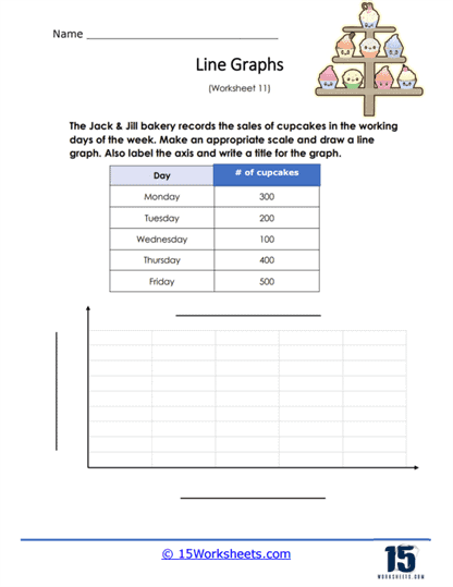
Jack & Jill Bakery Line Graph
This worksheet charts bakery sales-like muffins or pies-across days or weeks via line graph. It brings bread and business lessons together, showing how bakery operations ebb and flow. Students connect real-world shop stats with plotting, labels, and trend analysis. It builds data literacy with a side of bakery charm.
Monthly Rainfall Data
Students chart the amount of monthly rain using a line graph-a perfect way to link weather with visualization. Trends emerge: rainy seasons, dry spells, and weather cycles become clearer. They learn to connect climate patterns with plotted points and lines. It reinforces scientific observation through graph literacy.
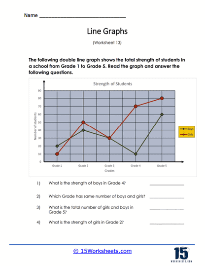
Interpreting Double Line Graphs
This worksheet steps it up by showing two datasets on one graph-like sales of two products over time. Students learn to differentiate lines, read comparisons, and understand dual trends. It’s a great exercise in nuanced interpretation and visual distinctions. It builds resilience in reading more complex graphs.
Reading Double Lines
Similar to the above, this activity tasks students with analyzing graphs that have multiple lines-such as comparing temperatures in two cities over time. They practice identifying which line belongs to which dataset, noting intersections and differences. It fosters deeper analytical thinking and careful reading. It scales up from simple to slightly trickier visual information.
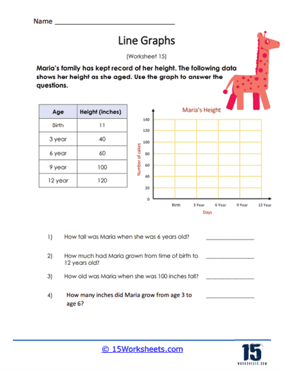
Maria the Giraffe
This worksheet shows how tall Maria the giraffe grows over time via a line graph. Kids visualize growth in an animal-friendly way-watching Maria stretch up the graph! It’s engaging, gentle, and perfect for young learners. It teaches how line graphs can track changes in living things, too.
What Are Line Graphs?
Line graphs, also known as line charts or line plots, are a type of graphical representation used to display data that changes over time or across a continuous variable. In a line graph, data points are plotted on a two-dimensional plane, with the x-axis typically representing time or an independent variable, and the y-axis representing the dependent variable. The data points are connected with lines to illustrate the trend, pattern, or relationship between the variables.
Line graphs are particularly useful for visualizing trends, fluctuations, and patterns in data over time or across continuous variables. They can help identify the direction and magnitude of changes, as well as reveal any correlations or relationships between variables.
Some common uses of line graphs include:
Finance – Line graphs are often used to track stock prices, exchange rates, or economic indicators like GDP growth and unemployment rates over time.
Research – Researchers can use line graphs to visualize changes in experimental data, such as temperature, pressure, or concentration, over time or as a function of another variable.
Healthcare – Line graphs can be used to track the progression of diseases, patient recovery, or the effectiveness of a treatment over time.
Environmental Studies – Line graphs can help visualize changes in climate data, such as temperature, precipitation, or air quality, over time or across geographic regions.
School – Teachers and students can use line graphs to represent data from experiments, to analyze trends in test scores, or to track progress over time.
When creating a line graph, it’s important to choose an appropriate scale for the axes, label the axes clearly, and select a suitable line style or marker to represent the data points. Additionally, multiple datasets can be plotted on a single line graph for comparison, but it’s essential to use different line styles, colors, or markers to distinguish between the datasets.
How to Spot Trends
Spotting trends in line graphs involves examining the graph for patterns, direction, and magnitude of changes. Here are some steps to help you identify trends in line graphs:
Overall Direction – Look for a general movement in the data points, either upward, downward, or relatively constant. An upward trend indicates an increase in the dependent variable, a downward trend indicates a decrease, and a constant trend indicates little or no change.
Identify Local Trends – In addition to the overall trend, there may be shorter-term trends or fluctuations within the data. Look for smaller upward or downward movements, which might be seasonal or periodic variations.
Steepness of the Lines – The slope of the lines connecting the data points can give you an idea of the magnitude of the change. Steeper lines indicate more rapid changes, while flatter lines indicate slower changes.
Look for Patterns – Some line graphs may exhibit repeating patterns or cycles. These patterns can be regular (e.g., seasonal fluctuations) or irregular (e.g., sudden spikes or drops).
Detect Outliers – Outliers are data points that are significantly different from the overall trend or pattern. Spotting these outliers can help you identify potential anomalies or unique events in the data.
Compare Multiple Datasets – If the line graph contains multiple lines representing different datasets, compare the trends, patterns, and magnitudes of change between them. This can provide insights into the relationships or differences between the datasets.
Consider the Context – To accurately interpret trends in a line graph, it’s essential to consider the context of the data, including the variables being measured, the time frame, and any external factors that might influence the data.
By carefully examining line graphs with these steps in mind, you can effectively spot and analyze trends, which can help inform decision-making, forecasting, and understanding the underlying factors that drive changes in the data.