Pie Charts Worksheets
About These 15 Worksheets
These worksheets will help students visually understand how data is divided into different parts of a whole. Pie charts, sometimes referred to as circle graphs, are a type of graph in which a circle is divided into sectors or “slices,” with each slice representing a proportion of the total. These worksheets are designed to teach students how to interpret, create, and analyze these graphs. By engaging with pie chart worksheets, students can develop a solid understanding of percentages, fractions, and proportional reasoning, as well as improve their ability to present data in a clear and visually appealing way.
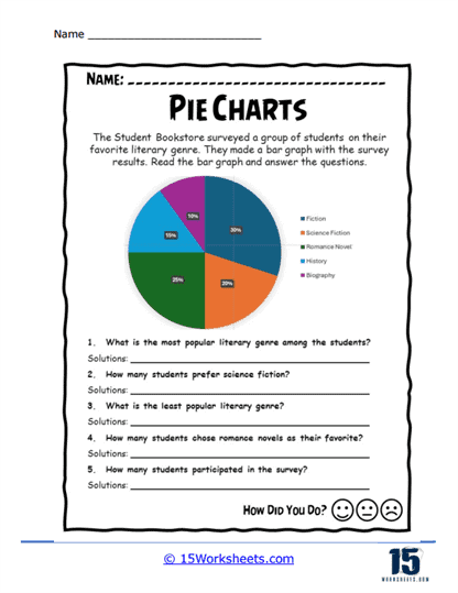
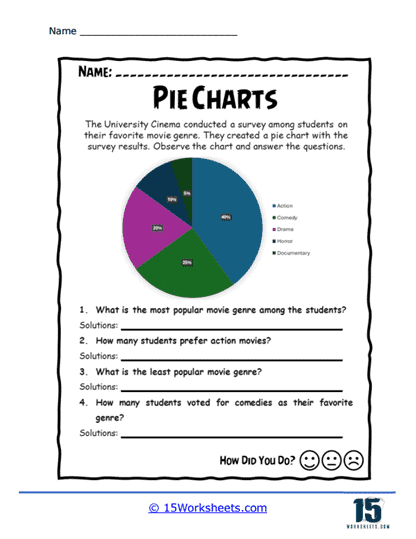
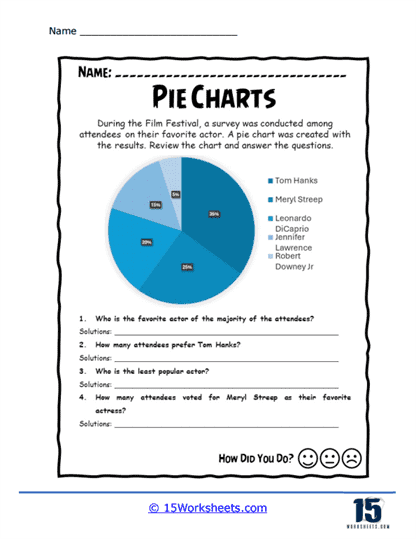
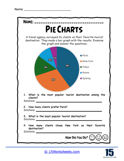
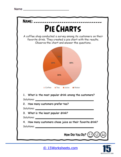
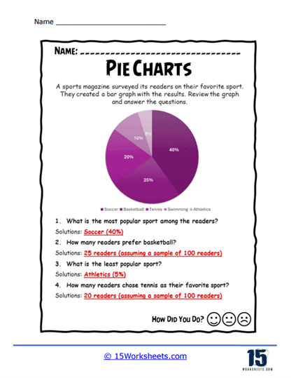
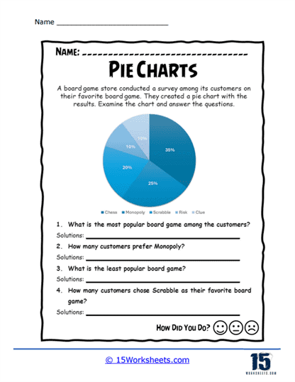
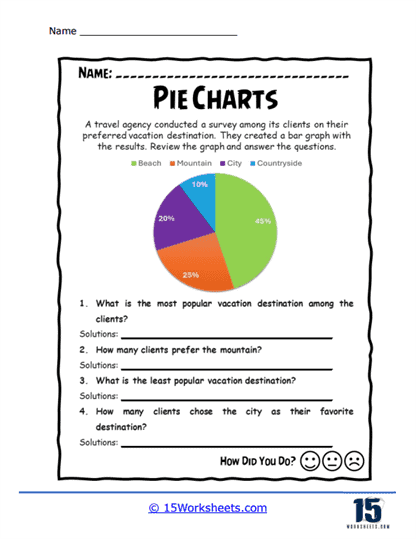
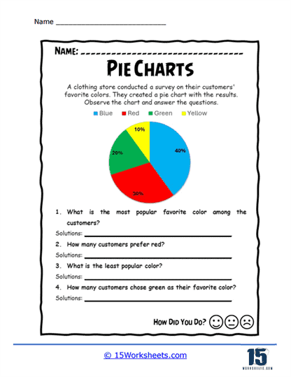
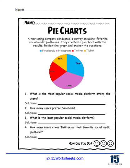
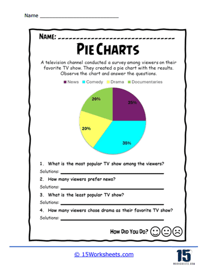
One of the most common tasks that you’ll find on these worksheets is interpreting existing pie charts. These tasks typically involve a pie chart that displays data in various categories, such as favorite school subjects, types of pets, or time spent on different activities throughout the day. The worksheet might ask students questions like, “Which category has the largest slice?” or “What percentage of the whole does this slice represent?” These questions help students practice their ability to read and understand pie charts by focusing on the relationships between the different slices and the whole. Interpreting pie charts helps students build their skills in identifying proportions and understanding how different parts contribute to the total.
Many worksheets also ask students to create their own pie charts based on a given set of data. These exercises often start with a table or list of data that students must convert into a pie chart. For example, a worksheet might provide the number of students who prefer each of several different types of food and then ask students to draw a pie chart to represent that data. To complete this task, students must calculate the percentage that each category represents of the total, and then use those percentages to determine the angle of each slice of the pie. Creating pie charts from data reinforces important math skills such as calculating percentages, understanding fractions, and applying these concepts to create accurate visual representations.
You may also need to learn to compare multiple pie charts. These exercises might present two or more pie charts that display related data sets, such as the distribution of time spent on activities by different age groups or the preferences of different demographic groups for various products. Students might be asked to compare the pie charts and identify similarities or differences in the data, such as which category is most popular in each chart or how the proportions change between groups. Comparing pie charts helps students develop their analytical skills by requiring them to identify trends and differences across multiple data sets. This type of activity also reinforces the importance of paying attention to the scale and labels of each chart, as these elements can significantly affect the interpretation of the data.
The worksheets include word problems that require students to apply their knowledge of pie charts to solve real-world problems. These word problems might describe a situation where a certain amount of something, like time or money, is divided into different categories, and students must create or interpret a pie chart to represent that division. For example, a word problem might describe how a family spends their monthly budget on different expenses and ask students to create a pie chart showing the percentage of the budget allocated to each category. Other problems might ask students to determine how much of a whole is represented by a specific slice, such as calculating how many hours are spent on homework if it takes up 25% of a 24-hour day. These word problems help students understand the practical applications of pie charts and reinforce their ability to use mathematical concepts to solve problems.
Another valuable skill that pie chart worksheets emphasize is the ability to calculate the angles for each slice of the pie. Since a pie chart is a circle, and a circle contains 360 degrees, students must learn to convert the percentage that each category represents into an angle for that slice of the chart. For example, if a category represents 25% of the total, the corresponding angle for that slice would be 90 degrees (since 25% of 360 degrees is 90 degrees). This process helps students reinforce their understanding of fractions, percentages, and degrees, and it also teaches them the importance of precision when creating graphs. Accurately calculating the angles ensures that the pie chart is an accurate representation of the data, which is essential for correctly interpreting the information.
In addition to creating and interpreting pie charts, some worksheets include activities that challenge students to analyze the effectiveness of pie charts in representing certain types of data. For instance, students might be given a set of data and asked to decide whether a pie chart is the best way to represent that data, or if another type of graph would be more effective. This type of activity encourages students to think critically about the strengths and limitations of pie charts, such as the fact that they are most effective when there are only a few categories or when the differences between categories are significant. By engaging in this type of analysis, students learn to choose the most appropriate graph for the data they are working with, which is an important skill in both academic and real-world settings.
Many of the exercises involve manipulating the data or the chart itself. For example, students might be asked to adjust a pie chart to reflect a change in the data, such as increasing the proportion of one category or adding a new category to the chart. These exercises help students understand how changes in the data affect the overall chart and reinforce the importance of accuracy in representing data. Additionally, these types of activities encourage students to think flexibly about data representation and to consider how different changes can impact the interpretation of the chart.
These worksheets often include a reflection or discussion component, where students are asked to consider what they have learned and how they might apply these skills in real-life situations. This might involve discussing how pie charts are used in business, science, or media to represent data, or brainstorming other situations where pie charts might be useful. Reflecting on the practical applications of pie charts helps students see the relevance of what they are learning and encourages them to think about how they can use these skills in their future careers and everyday lives.

