Histograms Worksheets

About These 15 Worksheets
Imagine a classroom filled with students, each with their own story of how many books they read in a month. Some are avid readers, tearing through novels, while others manage just one or two due to busy schedules. Now, what if you could take all that information and bring it to life through a visual tool that instantly reveals the reading habits of the entire class? This is where a histogram worksheet comes into play, transforming raw data into a clear, compelling picture that anyone can understand at a glance.
A histogram is more than just a graph; it’s a way to see patterns hidden inside numbers. For example, if you’re tracking how many books classmates read in a month, a histogram helps turn that list into something easy to understand. As students build these visual skills, they also benefit from learning how data connects to coordinate grid quadrants, where numbers and positions work together to show information clearly. You’ll start with simple data, but soon those numbers begin to tell a meaningful story instead of just sitting on the page.
A Look At Individual Worksheets
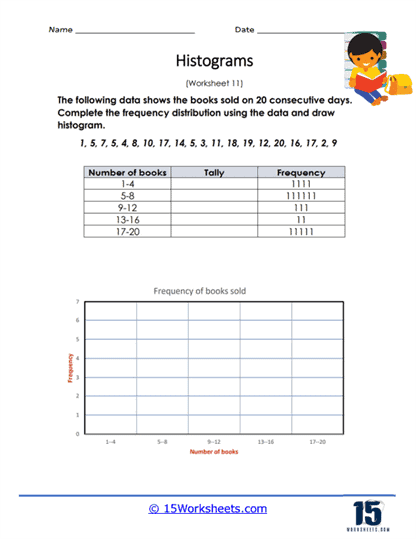
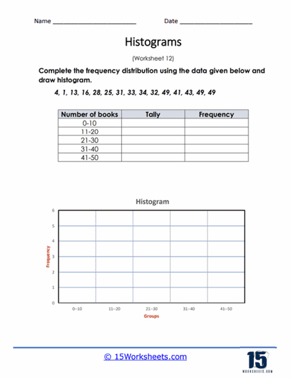
Some of these histogram worksheets are all about helping students get cozy with the basics-counting tallies, organizing frequency data, and making sense of raw numbers. Worksheets like Books Sold Tallies, Tally Frequency Distribution, and Frequency to Tally to Histogram feel a bit like detective work for math nerds. You’re handed a pile of scribbles and asked to find the pattern-kind of like reading tea leaves, but with more hash marks. These are the “let’s learn to walk before we histogram-run” sheets that train students to translate scratchy tallies into real-deal graphs.
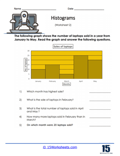
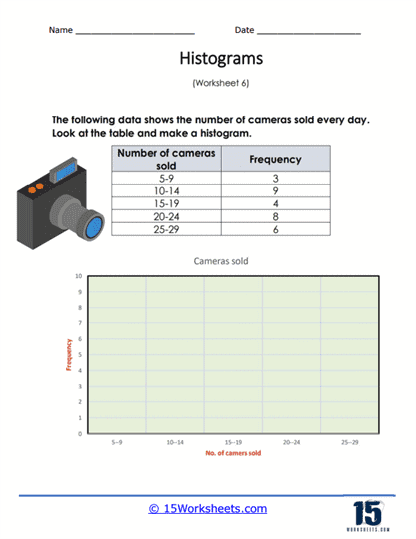
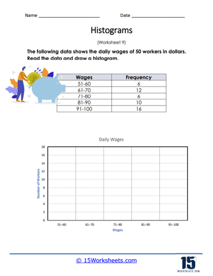
Other worksheets dive straight into real-world data that reads like a slice of everyday life… if your life were being quietly observed by a statistician. In Laptops Sold, Making a Camera Sales Histogram, and Daily Wage Frequency, students sift through information about how many electronics are sold, who earned what, and how trends stack up. They’re perfect for showing how the world leaves data trails everywhere-and once you know how to group that data into intervals and toss it into a histogram, the chaos starts to make sense. There’s even something oddly satisfying about watching wage disparities become bar-shaped.
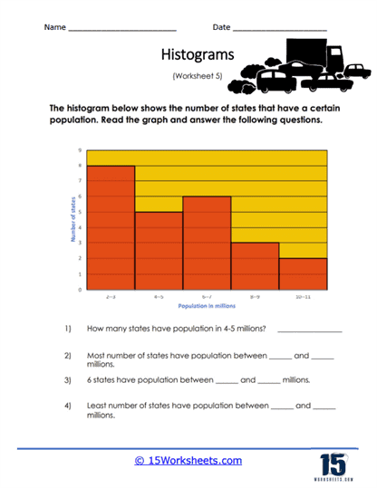
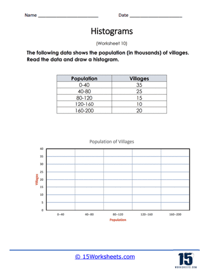
Then there’s a set of worksheets that gets a little sociological. State Population Distribution, Village Population Histogram, and Age Group Frequency give off big census energy. These ask students to group humans into neat age brackets or regional populations, which-if you’ve ever tried grouping humans-is much harder than it looks. The trick is all in binning: too many intervals and it’s visual clutter, too few and it’s as vague as a horoscope. These help students balance clarity with precision and start to see how population data can actually tell stories-especially when it piles up in weird, spiky places.
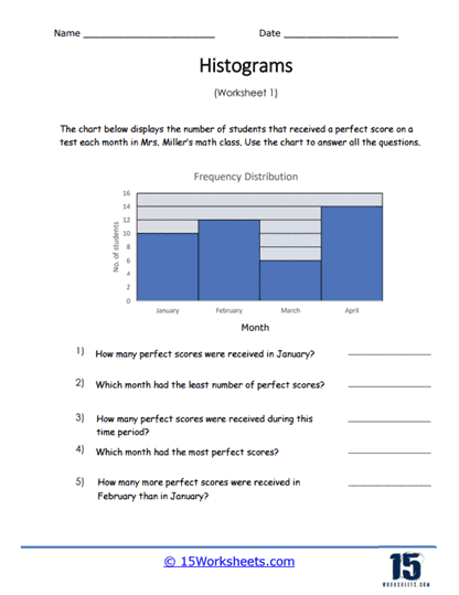
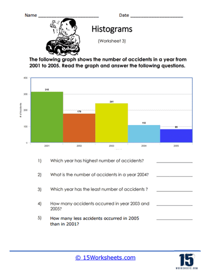
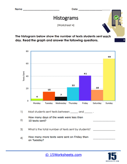
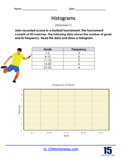
Some of the worksheets are just plain fun, if not a little chaotic. Perfect Score Histogram, Car Accident Histogram, Text Message Histogram, and Football Goals Scored are packed with juicy little data dramas. Will someone’s car insurance premium be changing soon? Did students all ace the test, or did the histogram reveal a plot twist? Why did one person send 400 texts in a day? These worksheets challenge students to choose smart bin sizes and spot outliers, and they serve as a gentle reminder that behind every bar in a histogram, there’s a person either crushing it, crashing it, or overusing their thumbs.
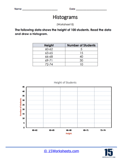
Then we have the oddly intimate or oddly industrial-depending on your mood. Height in Inches and Industry Histogram round out the set, inviting students to graph either how tall people are or where they work. This could spark debates like “are people in tech taller than people in agriculture?” (not a real question, but hey, graphs inspire strange thoughts). These encourage students to think about data not just in terms of numbers, but as things that describe people, professions, and how spread out or clustered those things can be.
What Are Histograms?
Histograms are a type of graphical representation used to display the distribution of a continuous dataset by grouping the data into a series of intervals or bins. Each bin represents a range of values, and the height of each bar in the histogram corresponds to the frequency (number of occurrences) or density (percentage) of the data points that fall within that specific bin.
Histograms are particularly useful for understanding the shape and spread of a dataset, such as identifying patterns, trends, or outliers. They can provide insights into the central tendency (mean, median, mode), dispersion (range, variance, standard deviation), and the overall distribution (normal, skewed, bimodal) of the data.
For example, if you have a dataset of test scores for a large group of students, you can create a histogram to visualize the distribution of scores. The x-axis would represent score ranges (bins), and the y-axis would represent the frequency or density of students who achieved scores within each bin. By examining the shape of the histogram, you can gain insights into the overall performance of the students and identify any trends or outliers in the data.
A class of 12 students receive the following scores out a possible 100:
88, 67, 98, 75, 85, 62, 76, 80, 90, 76, 91, 83
We would create a histogram like this:

We can quickly understand the frequency distribution of the scores. We can understand that a slight majority of the students scored over 80%.
It’s important to note that the choice of bin size and the number of bins can significantly impact the appearance of a histogram. Smaller bins may reveal more details about the data distribution, while larger bins may provide a more general overview. However, using too few or too many bins can lead to a misleading representation of the data, so it’s crucial to choose an appropriate bin size and number to accurately visualize the dataset.
What Are Histograms Best Used For?
Histograms are a great way to show how a bunch of numbers are spread out. They look like bar graphs, but instead of comparing different things, they focus on how often certain numbers appear in a set of data. To make a histogram, the data is grouped into ranges, called “bins,” and the height of each bar shows how many numbers fall into each range. This helps you see patterns, like whether most of the numbers are close together or spread far apart.
One cool thing about histograms is that they make it easy to spot trends in the data. For example, if the bars form a nice hill shape, that usually means the data is “normal” or balanced. But if the bars are bunched up on one side, it means the data is uneven or “skewed.” This can tell you whether something unusual is happening with the numbers, like an unexpected outlier that stands out from the rest.
Histograms are also helpful for understanding how much the numbers in the data vary. If the bars are tall and close together, it means the numbers are pretty similar. But if the bars are spread out and shorter, it means the numbers are more different from each other. This is important when you want to see how consistent the data is, like when you’re checking test scores or measuring results in a science experiment.