Bar Graphs Worksheets

About These 15 Worksheets
A bar graph, also known as a bar chart, is a visual representation of data using rectangular bars of different lengths. These worksheets will introduce you to the concept of bar graphs. You will learn that bar graphs are used to display and compare data in different categories or groups. They will provide you with data sets or information, and your task will be to create a bar graph based on that data. You will learn how to label the horizontal (x-axis) and vertical (y-axis) axes, and how to determine the appropriate scale for each axis.
You will also learn the importance of providing a clear and descriptive title for your graph. The title helps the reader understand what the graph represents. You will learn how to label the categories or groups being compared on the x-axis. For example, if the bar graph is about favorite fruits, the categories might be “apples,” “bananas,” “oranges,” and so on.
About Each Worksheet
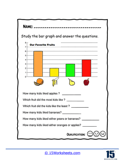
Favorite Fruit
This worksheet lets students explore fruit popularity while practicing how to read and compare bar heights. Kids will have fun figuring out which fruits win the popularity contest while building stronger graph-reading skills at the same time.
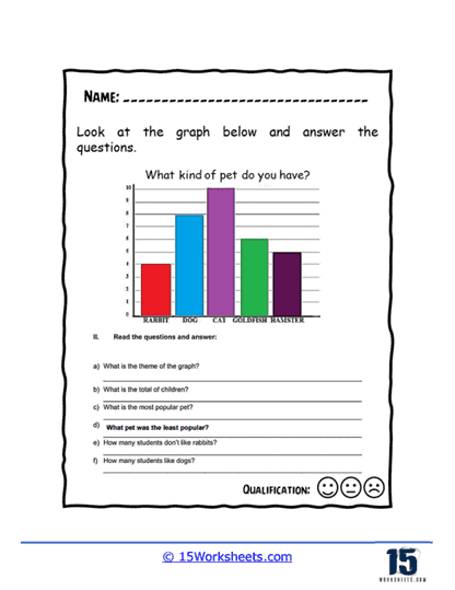
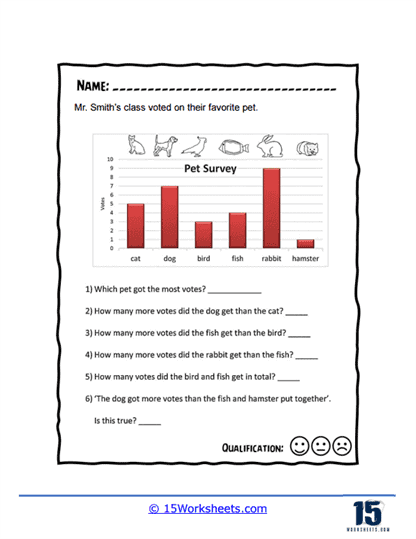
My Pets
Students analyze a pet survey filled with dogs, cats, rabbits, goldfish, and more as they answer questions based on the graph. The familiar topic keeps the activity fun while helping kids practice comparing numbers and interpreting visual data.
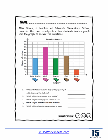
School Subjects
This worksheet gives students a peek into classmates’ favorite school subjects through an easy-to-read bar graph. It’s a great way to combine math practice with classroom topics kids already know and love discussing.
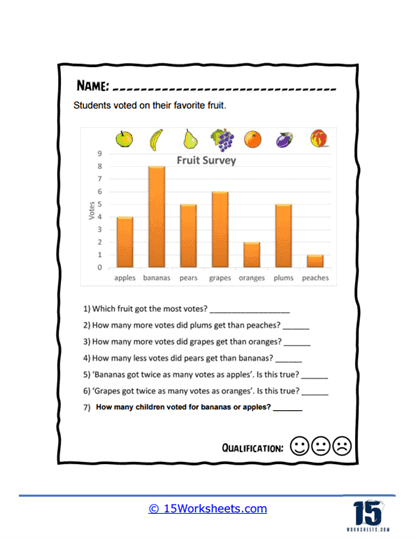
More Fruit
Students dive into another fruit-themed survey where they compare votes and identify the most and least popular snacks. The colorful data keeps learners engaged while reinforcing important graph interpretation skills.
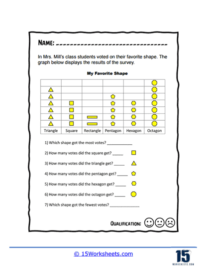
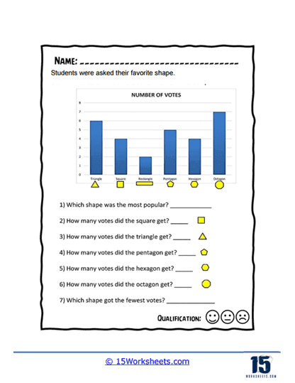
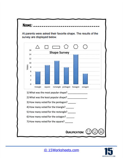
Favorite Shape
This worksheet mixes geometry and data analysis by asking students to explore which shapes classmates liked best. Kids practice reading bar graphs while reviewing familiar geometric shapes in a fun and approachable way.
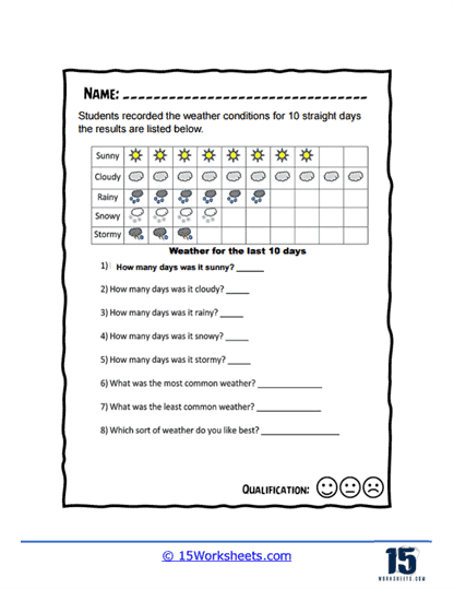
Horizontal Weather
Students become mini meteorologists as they analyze weather patterns recorded over several days. The horizontal graph format gives kids extra practice reading data in different layouts while keeping the topic relatable and interesting.
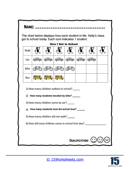
Travelling to School
This worksheet helps students explore how classmates get to school using graphs filled with walking, biking, buses, and cars. The real-world topic makes graph reading feel practical while encouraging students to compare transportation choices.
Shape Vertical Bars
Students investigate a shape survey and answer questions about which geometric figures earned the most votes. It’s a simple but engaging way to strengthen graph-reading confidence while sneaking in some geometry review.
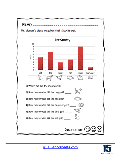
Mr. Murray’s Class
This pet survey worksheet challenges students to interpret data about popular classroom pets using a vertical bar graph. Kids will enjoy comparing favorite animals while practicing careful observation and number analysis.
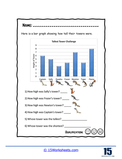
Tallest Tower
Students analyze a friendly tower-building competition by comparing the heights shown on the graph. The creative setup makes the worksheet feel more like a game while still reinforcing important data interpretation skills.
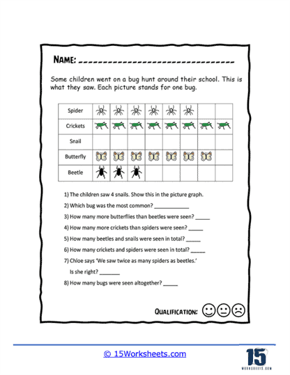
Bug Hunt Bars
This worksheet turns students into bug detectives as they study data collected during a schoolyard insect hunt. The bug-themed questions make graph practice feel adventurous while encouraging students to carefully compare quantities.
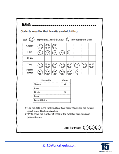
Sandwich Fillings
Students read a graph about favorite sandwich fillings and turn visual symbols into actual numbers. The silly and relatable food choices make the activity extra fun while helping kids strengthen counting and data skills.
Vertical Shapes Survey
This worksheet asks students to interpret a survey about adults’ favorite geometric shapes using a vertical bar graph. It’s a great way to combine graph analysis with shape recognition in one engaging activity.
Vertical Pets Survey
Students explore another pet survey and answer questions by comparing votes shown on the graph. The familiar pet theme keeps kids interested while giving them more practice reading and interpreting visual data.
Vertical Fruit Survey
This worksheet challenges students to analyze fruit survey results and compare which snacks earned the most support. The simple layout helps students focus on building strong graph-reading habits without feeling overwhelmed.
What are Bar Graphs?
A bar graph, also known as a bar chart or bar diagram, is a graphical representation used to display and compare data using rectangular bars. Each bar represents a category, and the height or length of the bar corresponds to the quantity or value of that category. Bar graphs are commonly used to show comparisons among discrete categories or groups.
There are two main types of bar graphs:
Vertical Bar Graph: In a vertical bar graph, the bars extend vertically from the horizontal axis (x-axis). The categories are displayed along the x-axis, and the values or quantities are represented on the vertical axis (y-axis).
Horizontal Bar Graph: In a horizontal bar graph, the bars extend horizontally from the vertical axis (y-axis). The categories are displayed along the y-axis, and the values or quantities are represented on the horizontal axis (x-axis).
Bar graphs are useful for presenting and comparing data in a visually clear and easy-to-understand manner. They can be used to display data across time, such as sales numbers over several months, or to compare values among different categories, such as the number of people in various age groups.
Here is an example:
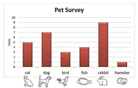
This is a quick example of a vertical bar graph of survey of what pets that students have at home. At a quick glance we can tell that in particular survey rabbits are the most popular pet and hamsters the least.
How Do Bar Graphs Help Us?
Bar graphs are valuable tools that help us in several ways:
Data Visualization
Bar graphs provide a visual representation of data, making it easier for us to understand and interpret information. Instead of sifting through numbers or tables, we can quickly grasp patterns, trends, and comparisons by looking at the bars of different heights. Bar graphs allow us to compare data across different categories or groups. By visually comparing the lengths of the bars, we can quickly identify which categories have higher or lower values. This comparison helps us understand relative differences and make informed decisions.
Trends and Patterns
Bar graphs enable us to identify trends and patterns in data. By analyzing the heights and positions of the bars, we can observe whether values are increasing, decreasing, or staying constant over time or across different variables. This helps us recognize patterns and make predictions. Bar graphs facilitate data analysis by presenting information in a concise and organized manner. We can identify outliers, anomalies, or significant variations between different categories. By examining the bars, we can make connections, draw conclusions, and gain insights from the data.
Communication and Decision-Making
Bar graphs are effective tools for presenting data to others. They provide a clear and visually appealing way to convey information. Whether in reports, presentations, or academic settings, bar graphs make it easier for others to understand the data and the message being communicated. Bar graphs assist in decision-making processes. They provide a visual summary of information, making it simpler to assess different options or scenarios. Bar graphs help us weigh alternatives, analyze data, and make more informed choices.
Track Progress and Performance
Bar graphs are often used to track progress and performance over time. By regularly updating a bar graph with new data points, we can monitor changes, track improvements, and measure success in various areas, such as academic performance, sales figures, or personal goals. Bar graphs simplify complex data sets by breaking them down into manageable and understandable visual representations. Instead of overwhelming us with raw data, they condense information into a clear and concise format, making it easier to comprehend and work with.