Line Plots Worksheets

About These 15 Worksheets
Line plots are one of those math tools that look simple but pack a big punch. They take a row of numbers and dots and turn them into a clear picture of how often something happens. These worksheets help kids practice creating and reading line plots from all sorts of real-world data: from donut diameters and crayon lengths to favorite colors and dice rolls. By working with fun, everyday examples, students get comfortable with the process without even realizing how much math they’re practicing.
Each worksheet in the collection has its own theme, which keeps kids from getting bored. Some lean into measuring and recording data (like nails, crayons, or donuts), while others highlight surveys and counts (like school transportation or cake flavors). This variety helps kids understand that line plots aren’t just “school graphs”-they’re actually useful in lots of situations. Bit by bit, children build confidence in organizing information visually.
These worksheets connect math to real life in a simple, meaningful way. Students begin to see how line plots can track trends, show preferences, and reveal patterns in everyday activities. As they grow more comfortable working with data, they can move toward understanding graph quadrants, where numbers are placed on a grid to show exact positions and relationships. It’s a natural next step that builds on their ability to organize and interpret information visually.
Have a Look Inside Each Worksheet
Sports Line Plot
Students plot the number of points scored in various sports on a line plot. They learn to represent values visually and count how often each score appears. It feels like organizing a mini world championship data sheet. Great for recognizing frequency patterns quickly.
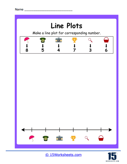
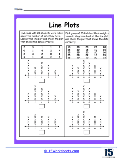
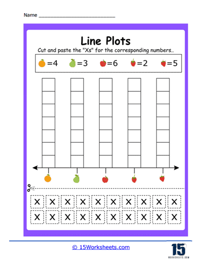
Corresponding Number Plots
The worksheet provides pairs of matching data sets students plot side by side. Learners practice aligning related information intuitively. It’s like setting up twins on a number line. Reinforces comparison skills and visual data matching.
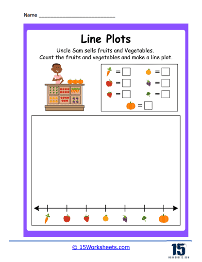
Uncle Sam’s Fruit
Students tally how many of each fruit (like apples, oranges) Uncle Sam collects and plot it. They learn to translate everyday counts into visual representations. Its “fruit basket turned stats class” vibe makes math approachable. Builds skills in counting and plotting from real-life contexts.
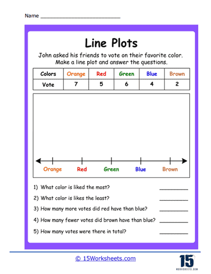
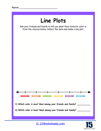
Favorite Color Plot
Children survey peers’ favorite colors and plot data on a line for each color chosen. They practice transferring survey responses into a clear visual format. It’s like creating a colorful popularity contest. Teaches students how to interpret preferences statistically.
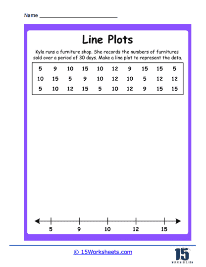
Furniture Sold Plot
The number of furniture items sold each day becomes data for plotting. Students chart daily sales to spot trends. It’s like turning a furniture store log into a math graph. Great for linking math to business basics.
Dot Plots
This general worksheet focuses on plotting small datasets with dots on a number line. Students master the basics of line plots and dot placement. Think of it as math’s “connect-the-dots without the connecting.” A foundational tool for data literacy.
School Transportation Plot
Kids survey classmates on how they get to school-bus, walking, car-and plot the results. They learn to convert familiar daily routines into data visualizations. It’s like counting how everyone travels in graph form. Reinforces plotting and category comparison.
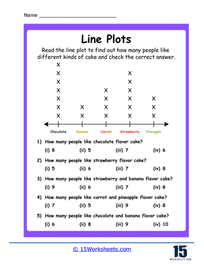
Different Cake Plot
Students track and plot the popularity of different cake flavors. They’ll translate delicious options like chocolate, vanilla, or strawberry into frequency dots. It’s sweet and educational at the same time. Helps connect data handling with fun choices.
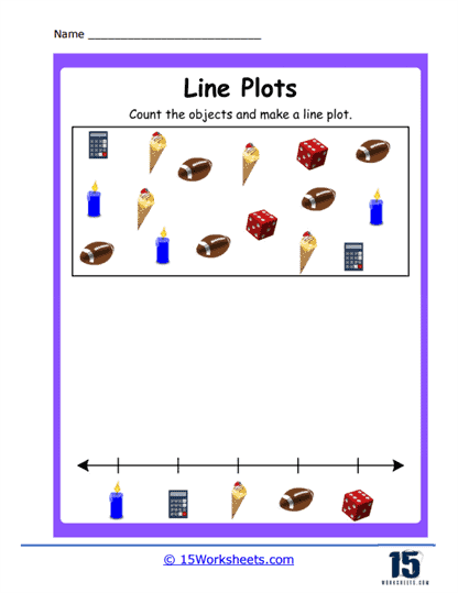
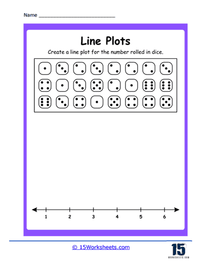
Dice Plot
Using rolls of dice, learners plot the frequency of each outcome. They turn random rolls into visual frequency charts. It’s like turning “rolls and randomness” into organized dot patterns. Perfect for combining probability and data skills.
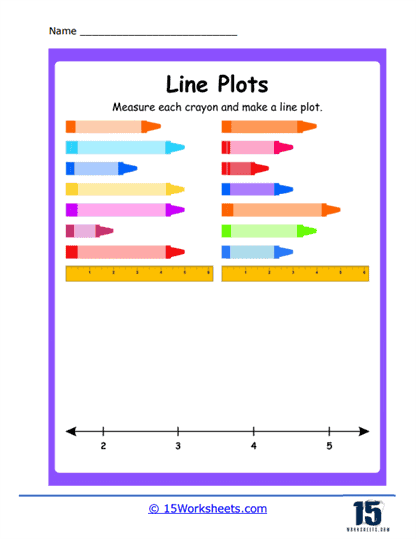
Crayon Length Plot
Kids measure broken crayon pieces and plot the lengths on a line plot. They connect hands-on measuring with data visualization. It’s playful and practical-science meets art supply! Builds measurement, plotting, and observational skills.
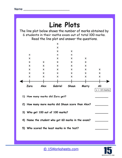
Math Exam Plot
Students plot classmates’ exam scores to examine distribution visually. They turn grades into line plot visuals at a glance. It’s like analyzing test results with math shapes instead of numbers alone. Encourages discussion about performance trends.
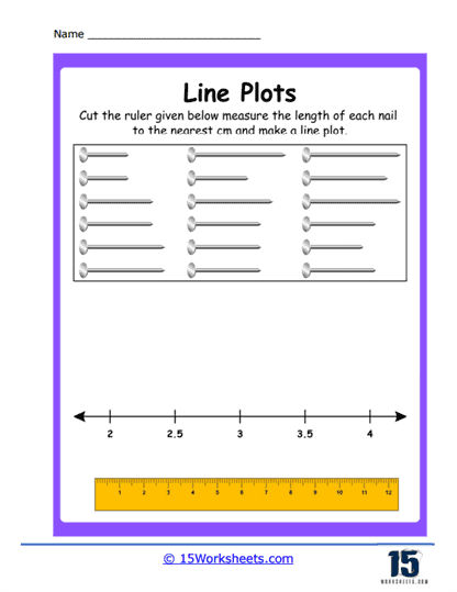
Nail Length Plot
Kids measure nail lengths (any nails-fingernails or project nails) and plot them. Combining measurement with visual reporting, they see how data clusters or varies. It feels like conducting a mini DIY science experiment. Enhances measurement and comparison skills.
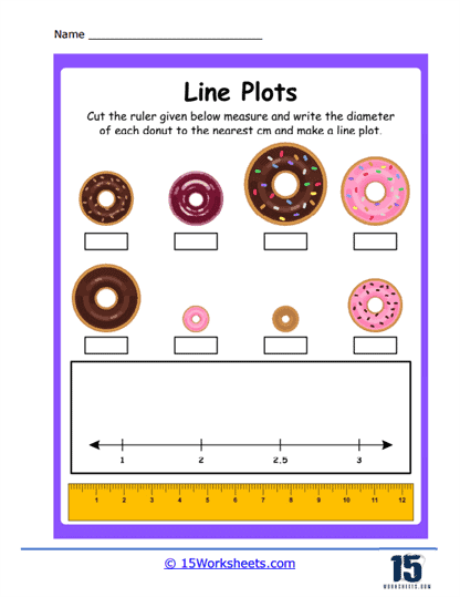
Donut Diameter
Learners measure donuts and plot their diameters on a number line. Asking them to measure and plot tasty treats keeps things engaging. It’s like donut tasting meets math plotting! A fun way to introduce data and measurement together.
Making Line Plots
Given a set of numbers, students are instructed to create a complete line plot from scratch. They organize and visualize data themselves. It’s their own math creation-data to graph. Great for reinforcing the full plotting process.
Free Practice Plot
This open-ended sheet invites learners to choose or receive any data and plot it. It encourages student-led plotting and creative thinking. It’s like giving them an artist’s blank canvas-but with dots and numbers. Perfect for independent practice and confidence building.
When Would I Use a Line Plot?
A line plot, also known as a dot plot or line chart, is a type of graph that displays data points on a number line, often used in statistics and data analysis. It is especially useful when you want to visualize the distribution and frequency of data points for relatively small sets of data. Here are situations when you might use a line plot:
Simple Data Visualization – Line plots are straightforward and easy to read. If you have a small dataset and want a quick visualization to understand its distribution, a line plot is a great choice.
Highlighting Specific Data Points – If you want to emphasize individual data points or values in a dataset, line plots can be particularly useful since each data point is represented distinctly.
Showing Frequency – For datasets where certain values repeat, a line plot can visually depict the frequency of each value. The height of the stacked dots for each value indicates its frequency.
Analyzing Trends Over Time – While line plots and line charts are different, the terms can sometimes be used interchangeably. If you’re referring to a line chart, it’s useful for showing changes over a continuous interval or time period. For example, stock prices over time, monthly sales, or temperature changes across days would be suitably represented using a line chart.
Identifying Clusters and Gaps – Line plots allow you to quickly see where data is clustered and where there might be gaps or outliers.