Circle Graphs Worksheets

About These 15 Worksheets
Circle graphs-also known as pie charts-are a colorful and engaging way to show data as parts of a whole. Instead of long lists of numbers, students get to see information broken into slices, making it easier to understand at a glance. Whether it’s favorite foods, daily activities, or school subjects, these graphs turn data into something visual and meaningful. It’s like turning numbers into a picture you can instantly read.
This collection of circle graph worksheets helps students build confidence in reading, interpreting, and even creating their own pie charts. Some worksheets focus on analyzing ready-made graphs, while others guide students through building their own from raw data. Along the way, learners practice key skills like comparing quantities, working with percentages, and understanding fractions. The mix of real-life themes keeps things relatable and fun, making each activity feel less like work and more like discovery.
Circle graphs also connect to real-world skills that students will use far beyond the classroom. Businesses use them to track sales, scientists use them to display results, and even news reports rely on them to share information quickly. By practicing with these worksheets, students learn how to make sense of data and communicate it clearly. It’s a practical skill wrapped in a bright, easy-to-understand format.
For example, if you want to display the distribution of different types of transportation used by a group of people, you can create a circle graph with sectors representing the percentages of people using cars, bicycles, public transportation, and walking. This allows the viewer to quickly and easily compare the popularity of each transportation mode.
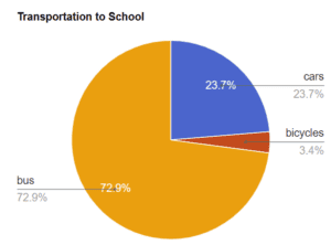
Example: The above circle graph describes the different forms of transportation that students use to get to school.
From this graph we can quickly understand that the mass majority of students get to school using a bus (72.9%). The fewest number of students ride bicycles to school.
About Each Worksheet
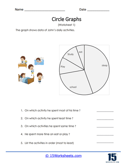
Daily Activities Circle Graph
This worksheet shows how a full day can be broken into different activities like sleep, school, and play. Students study the pie chart and answer questions about how time is spent. It’s a great way to connect math with everyday life. The visual slices make comparisons easy and clear. Try asking students to create their own daily chart afterward!
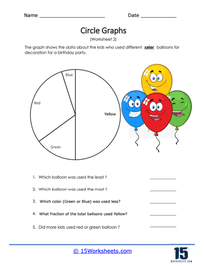
Colored Balloons Circle Chart
This fun worksheet explores favorite balloon colors for parties. Students compare slices to see which colors are most and least popular. It’s a cheerful way to practice reading data. The bright theme keeps things engaging. Perfect for a quick and colorful math activity!
Construct a Sports Circle Graph
Here, students take raw data about favorite sports and turn it into a pie chart. They learn how to divide a circle into correct sections. It’s a hands-on way to understand proportions. The activity builds both math and visualization skills. A great introduction to creating graphs from scratch!
Algebra and Circle Graphs
This worksheet blends circle graphs with basic algebra skills. Students convert percentages into actual numbers using the chart. It helps connect visual data with numerical understanding. The task encourages careful thinking and calculation. A nice step toward more advanced math concepts!
Making Shopping Circle Graphs
Students use store sales data to build their own pie chart. Then, they answer questions about what sold the most and least. It’s a practical, real-world math activity. The worksheet shows how businesses use data every day. A great mix of math and everyday problem-solving!
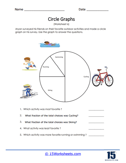
Outdoor Activities Graph
This worksheet presents a survey of favorite outdoor activities. Students analyze the chart and answer questions about preferences. It’s perfect for practicing fractions and comparisons. The topic feels relatable and fun. A great way to bring math outside-at least in spirit!
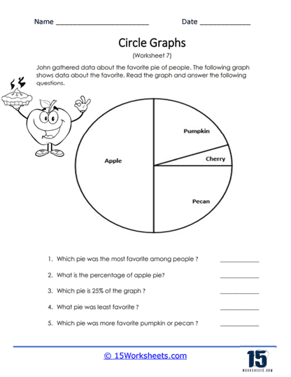
Favorite Pies
Students explore a pie chart all about favorite pie flavors. They identify which slices are biggest and smallest. The worksheet also includes fraction and percentage questions. It’s a tasty way to practice math skills. You might even inspire a pie-themed discussion!
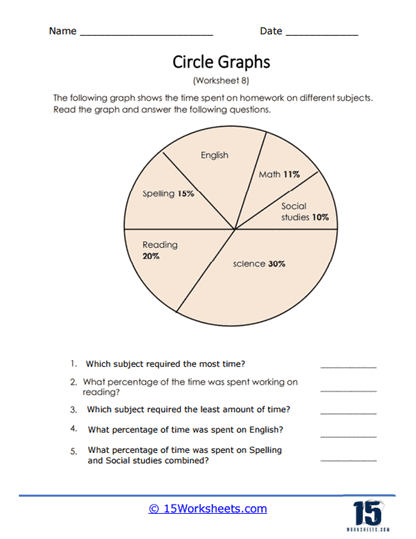
Homework Time Graph
This worksheet breaks down how students spend time on homework subjects. Learners analyze which subjects take the most and least time. It reinforces understanding of percentages and totals. The real-life connection makes it especially useful. A great tool for both math and reflection!
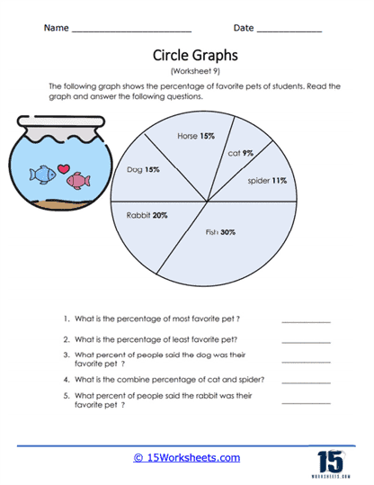
Percentage of Favorite Pets
This worksheet uses a pet survey to teach percentage-based graphs. Students answer questions about popularity and combined totals. It’s a fun way to work with numbers and comparisons. The variety of animals keeps students interested. Perfect for animal lovers and math learners alike!
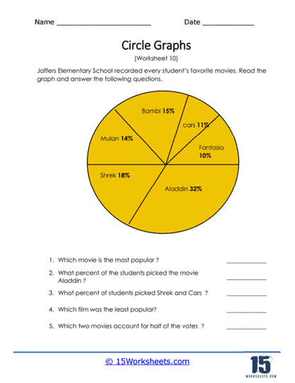
Favorite Movie
Students explore a pie chart of favorite movies and analyze the results. They compare popularity and calculate percentages. The familiar theme makes the activity engaging. It’s a great way to connect math with entertainment. Movie night meets math class!
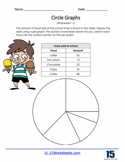
School Food Survey
This worksheet asks students to turn food sales data into a circle graph. They match items to the correct slices based on quantity. It reinforces the idea of proportions in a hands-on way. The activity builds both reading and creating graph skills. A tasty way to learn data representation!
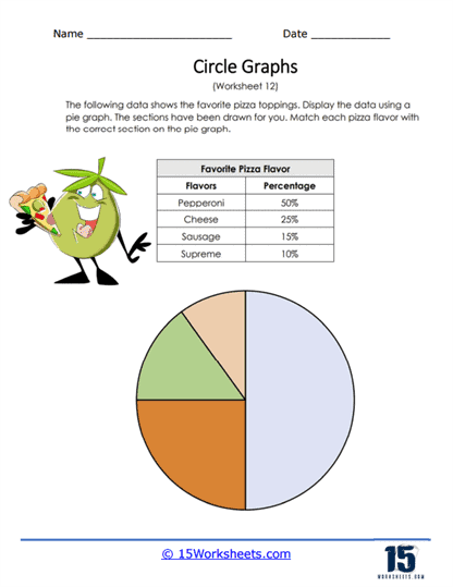
Pizza Toppings Pie Chart
Students work with percentages to complete a pie chart of pizza toppings. They match data to the correct slices on the graph. It’s a fun and familiar topic that keeps learners engaged. The worksheet reinforces understanding of percentages and fractions. Who knew pizza could teach math?
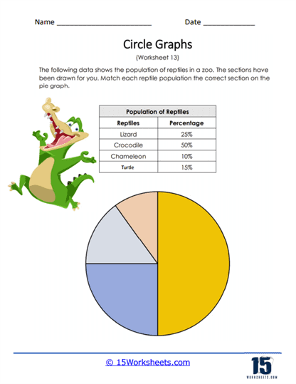
Reptile Population Graph
This worksheet uses zoo data to teach circle graphs. Students match reptile categories to the correct chart sections. It’s a great way to practice interpreting percentages. The animal theme adds an extra layer of interest. A perfect mix of science and math!
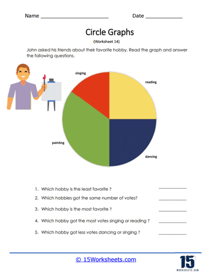
Hobby Graph
Students analyze a chart showing favorite hobbies like reading and dancing. They answer questions about popularity and comparisons. The worksheet encourages careful observation. It’s relatable and easy to understand. A great way to connect math with everyday interests!
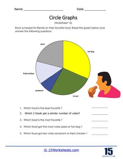
Rock Foods Graph
This worksheet presents a survey of favorite foods. Students interpret the pie chart and answer comparison questions. It helps build confidence in reading visual data. The familiar topic makes it approachable. A fun and simple way to practice graph skills!
What are Circle Graphs?
A circle graph, often called a pie chart, is a way to show data as parts of a whole. Imagine a pizza cut into slices-each slice represents a portion of the total. The bigger the slice, the bigger the share of that category. It’s a simple and visual way to understand how different pieces fit together. Instead of reading lots of numbers, you can quickly “see” the information.
Circle graphs are used all around us in everyday life. You might see them in news reports, business presentations, or even school surveys. They help people compare things quickly, like which product sells the most or how time is spent during the day. Because they’re so visual, they make data easier to understand for everyone. It’s one of the most popular ways to present information clearly.
Learning about circle graphs helps students build strong math and thinking skills. They practice working with fractions, percentages, and comparisons. They also learn how to interpret and communicate data in a meaningful way. These skills are important for subjects like math, science, and even social studies. In the end, circle graphs turn numbers into stories that students can easily read and understand.