Favorite Food Picture Graph
Worksheet Description
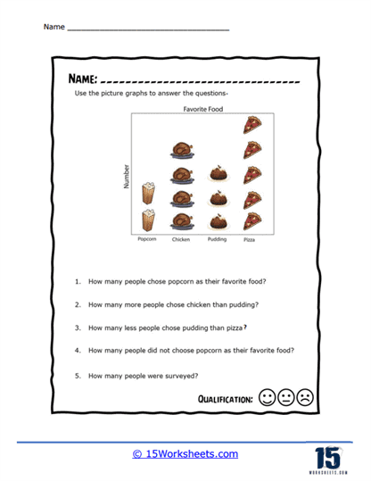
This is a picture graph that shows how popular different foods are. The food includes popcorn, chicken, pudding, and pizzas. You will then answer the questions that are provided on the bottom of the page.
This worksheet includes a pictograph titled “Favorite Food,” which illustrates the food preferences of a group of people, with images representing popcorn, chicken, pudding, and pizza. Each image correlates to a certain number of people’s choice for their favorite food. The activity provides five questions based on the pictograph that ask students to identify quantities such as the number of people who chose each food item, make comparisons between the numbers of people who chose different food items, and deduce the total number of people surveyed.
The worksheet teaches students how to read and interpret data from a pictograph, which is a visual tool for representing statistical data. It encourages them to apply counting and comparison skills to answer questions about the data. The worksheet also aims to enhance critical thinking by asking students to analyze and compare the data points represented pictorially. This exercise helps students practice basic data interpretation, an essential skill in understanding graphs and charts in various academic disciplines.