Burger Time Data Chart
Worksheet Description
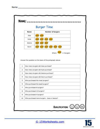
This pictograph shows the number of hamburgers that each person purchased for themselves and their friends. Each burger on the diagram represents the purchase of 2 hamburgers.
This worksheet is titled “Burger Time” and presents a pictograph that depicts the number of burgers purchased by four individuals: Jose, Kylie, Jessica, and Kevin. Each image of a burger on the pictograph represents two burgers. Below the pictograph, there are ten questions that require the student to analyze the data represented in the graph. Students must identify quantities such as who bought the most and the least burgers, and compare the numbers of burgers purchased by different individuals.
The purpose of the worksheet is to teach students how to interpret and extract information from a pictograph. It helps students practice their counting by multiples of two, understand representations of data, and develop comparative analysis skills. The questions are structured to encourage critical thinking as students must deduce the answers based on the visual information provided. This activity is also aimed at enhancing students’ ability to translate pictorial data into numerical values and make comparisons, which are key skills in understanding graphs and charts in mathematics.