Colored Balloons Circle Chart
Worksheet Description
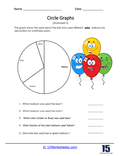
Students were asked the colors of balloons that they use for birthday parties. The collection of yellow, red, green, and blue was compiled to create a circle graph. Compare which balloon colors students prefer.
This worksheet includes a pie chart that displays data on the color preferences for balloons used by children for decoration at a birthday party. The chart is divided into four sections, each representing a different color: red, blue, yellow, and green. Accompanying the graph are questions that prompt students to identify which color balloon was used the most and least, compare the usage between two colors, determine the fraction of total balloons that were yellow, and assess which color was more popular between red and green.
The purpose of the worksheet is to teach students how to interpret data from a pie chart, understand fractions in a practical context, and make comparative judgments based on the chart’s segments. It helps students to visualize and understand proportions and relative sizes within a dataset. The exercise also encourages the development of analytical skills by asking students to make observations and draw conclusions from the visual information presented. Additionally, it introduces students to the application of fractions in interpreting sections of a whole, which is a fundamental mathematical skill.