Homework Time Graph
Worksheet Description
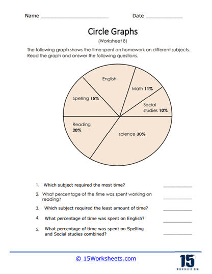
The circle graph on this worksheet displays the percentage of time students spend working on homework for different school subjects. Answer all the questions that are based on this graph. It provides a pie chart detailing the time allocation for homework across different school subjects, such as English, Math, Social Studies, Science, Reading, and Spelling. The chart is divided into segments that reflect the percentage of time spent on homework for each subject. Students are prompted to use the pie chart to answer questions regarding which subject took up the most and least time, determine specific percentages for subjects, and calculate combined time spent on related subjects.
The worksheet educates students on how to interpret pie charts, a common method for displaying data proportionally. It teaches them to identify the largest and smallest segments, indicating the most and least time-consuming homework subjects. The exercise also reinforces the understanding of percentages and their use in representing parts of a whole. By calculating combined percentages for Spelling and Social Studies, students further practice their skills in adding fractions or percentages to find total proportions, an important aspect of data analysis and interpretation.