Rock Foods Graph
Worksheet Description
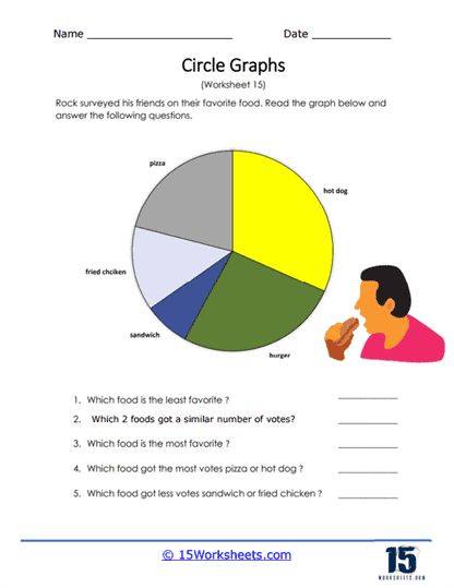
Rock asked his friends what they enjoyed eating. Students identified 5 different foods. Answer all of the questions based on this data chart.
This worksheet is centered around a circle graph that represents a survey on favorite foods. The survey, conducted by a character named Rock, asked friends to choose their preferred food item from options like pizza, hot dogs, burgers, sandwiches, and fried chicken. The circle graph displays the results with different-sized segments corresponding to each food’s popularity. Students are tasked with interpreting the graph to answer questions about which food is the least and most favorite, identifying foods with similar popularity, and comparing the votes of certain food pairs.
The worksheet’s objective is to enhance students’ abilities to analyze and interpret data displayed in a pie chart. It teaches them to discern relative sizes of segments to draw conclusions about the data, such as identifying the most and least popular items. The questions guide students to compare and contrast the segments, promoting the understanding of visual data representation. Additionally, this form of data analysis is a foundational skill in math that helps students in problem-solving and decision-making based on graphical information.