Favorite Pies
Worksheet Description
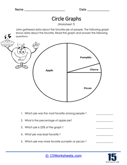
John gathered data about the favorite pie of people. The circle graph displays all the data that was collected. Which pies are the most and least popular.
The worksheet features a pie chart that John has used to gather data on people’s favorite types of pie. The chart segments represent different pie flavors: apple, pumpkin, cherry, and pecan. Students are tasked with reading the pie chart and answering questions that ask them to identify the most and least favorite pie, calculate the percentage and fraction of the graph that apple pie represents, and make a comparison between the popularity of pumpkin and pecan pies.
This worksheet is designed to teach students how to analyze and interpret information from a pie chart. The questions guide students to understand proportions and percentages and apply them to find specific information. By determining which pie flavor is most and least popular, students practice making inferences from graphical data. The worksheet also encourages the development of mathematical reasoning skills, as students must estimate and calculate portions of the pie chart to answer the questions accurately.