Favorite Movie
Worksheet Description
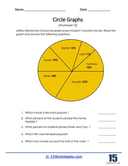
Students were asked about their favorite full-length movie. Who would have known that they were all Disney classics? A circle graph was drawn to feature the data. Answer all the questions based on the movie choices of the students. This worksheet features a pie chart from Jaffers Elementary School that captures data on students’ favorite movies. The movies listed are “Aladdin,” “Shrek,” “Bambi,” “Mulan,” “Cars,” and “Fantasia,” with each movie’s slice size representing its popularity among the students. The accompanying questions direct students to identify the most and least popular movies based on the chart, calculate specific percentages, and determine which two movies make up half of the total votes.
The worksheet is designed to teach students how to interpret data from a pie chart by analyzing the relative sizes of the slices to determine popularity. It helps students practice calculating percentages and understanding how they relate to the distribution of the whole set of data. The questions also encourage students to add percentages together, further reinforcing their skills in working with fractions and parts of a whole. This exercise not only enhances students’ abilities to work with graphical data but also illustrates how data can be visually represented in a way that is easy to understand and analyze.