Favorite Fruit Bar Graph
Worksheet Description
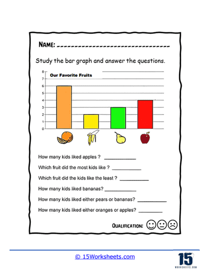
Students were surveyed as to their favorite of four fruits. The fruits of choice include oranges, apples, pears, and bananas. The data is presented as a bar graph. Students will interpret the bar graph and answer questions. This worksheet features a bar graph titled “Our Favorite Fruits” and is designed to teach students how to interpret data from bar graphs. The graph illustrates the preferences of a group of kids for different fruits, with each fruit represented by a bar of a certain height corresponding to the number of kids who like that particular fruit. Below the graph, there are questions for students to answer based on the information presented, such as determining the number of kids who like certain fruits, which fruit is most and least popular, and combinations of preferences.
The worksheet’s objective is to develop students’ skills in reading and understanding bar graphs, a fundamental aspect of data interpretation in mathematics and statistics. By answering the questions, students practice extracting specific information, such as quantities and comparisons, from the visual data representation. It encourages analytical thinking as students must analyze the heights of different bars to determine the popularity of each fruit. This activity not only reinforces the concept of measurement and comparison but also introduces students to the practical application of graphs in representing and making sense of real-world data.