Vertical Fruit Survey
Worksheet Description
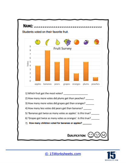
Another fruit vertical bar graph for you to interpret the data from. See how much meaning you can get out of this data.
This worksheet showcases a bar graph titled “Fruit Survey,” which displays the results of a poll in which students voted for their favorite fruit. The fruits included in the survey are apples, bananas, pears, grapes, oranges, plums, and peaches, with the number of votes for each depicted by the height of the bars on the graph. Students are asked to interpret the data to answer questions regarding which fruit received the most and least votes, and to make comparative numerical assessments between the votes received by different fruits. The worksheet is structured to enhance students’ understanding of data presented in a bar graph through direct interaction with the graph.
The worksheet aims to teach students how to read and interpret bar graphs, identify trends, and make comparisons based on the data presented. It enhances their numerical skills by requiring them to calculate the difference in votes between fruits and verify the truth of statements regarding the data. This activity also encourages critical thinking as students must analyze the graph to determine the accuracy of comparative statements. By engaging with this worksheet, students are learning to translate visual data into quantitative information, which is a fundamental aspect of data literacy.