Make a Balloon Sales Graph

Worksheet Description
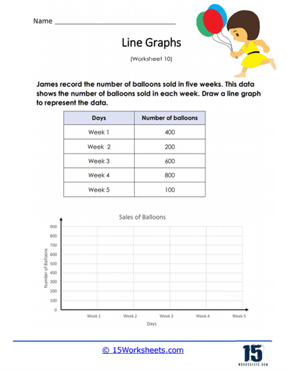
James recorded the number of balloon sales over the course of 5 weeks. The data that is located in the table indicates these values. Take that data and convert it into a line graph on the space that is provided.
This worksheet is designed to help students learn how to represent data using a line graph. It provides a table of data that shows the number of balloons sold over a period of five weeks. Students are tasked with plotting this data on the provided graph, marking the number of balloons sold on the vertical axis against the corresponding week on the horizontal axis. Once plotted, they will connect the points to form a line graph, visually depicting the sales trend over the five-week period.
The worksheet aims to teach students how to create a line graph from a given set of numerical data. It emphasizes the skills of plotting points accurately according to the values provided in the table and drawing lines to connect these points, thereby illustrating changes and trends over time. This exercise is crucial for understanding how to analyze and present data visually, which is a fundamental component of data interpretation in mathematics, science, and economics. Completing the graph will enhance the student’s ability to understand and communicate information through graphical means.
