Making a Zebra Line Graph
Worksheet Description
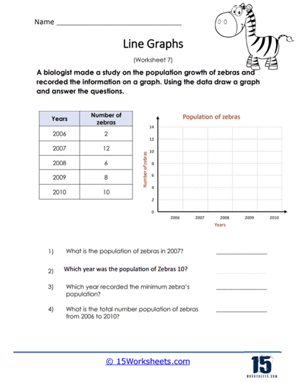
A biologist studied the population group of zebras in a particular region of the world. The information was recorded into a data chart. Use this data to create a line graph and then answer all of the questions that are provided at the bottom of the page.
The worksheet provides a table with data on the population of zebras over a five-year period from 2006 to 2010. The student’s task is to use the data to draw a line graph on the provided grid, plotting the number of zebras against the corresponding years. The aim is to visually represent the changes in the zebra population over time. After completing the graph, students must use it to answer questions regarding specific population values in certain years, identify trends such as increases or decreases in population, and calculate the total population over the studied period.
The worksheet teaches students how to create a line graph from a set of data, a key element of data visualization in mathematics and science. It also reinforces skills in interpreting graphical data to extract information and perform basic calculations. Through this exercise, students enhance their understanding of trends and patterns in data, as well as their ability to summarize and convey information graphically. The activity combines the application of mathematical skills with an understanding of biological data, providing a practical context for learning.