Favorite Color Plot
Worksheet Description
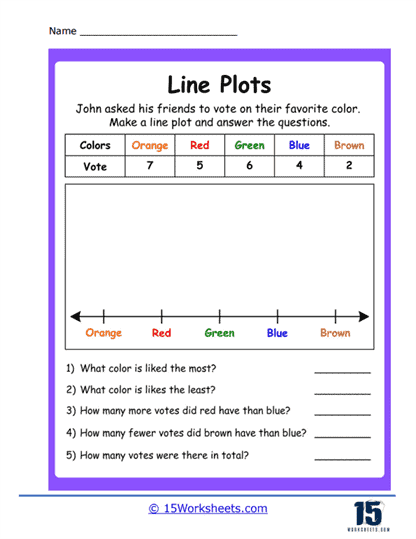
This worksheet presents a line plot activity based on a color preference survey. John has asked his friends to vote on their favorite color, and the results are listed in a table with the colors orange, red, green, blue, and brown alongside their respective vote counts. The students’ task is to create a line plot on the graph below the table, using the given data. After plotting, they are to answer questions about which color is most and least liked, comparative vote counts between colors, and the total number of votes cast.
The worksheet aims to teach students how to construct and interpret a line plot from a set of data. It reinforces the concept of frequency by having students plot the number of votes each color received. The questions prompt students to analyze the line plot to draw conclusions about the data, such as determining the popularity of certain colors over others. This activity also enhances the students’ skills in basic arithmetic operations, such as addition and subtraction, within a real-world context of data analysis.