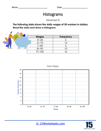
Daily Wage Frequency
Worksheet Description
You are given a data table that shows the frequency of daily pay of workers. Use this table to create a histogram.
This worksheet provides a frequency distribution table that lists the daily wages of 50 workers in dollar ranges and requires the student to construct a histogram based on the provided data. The table categorizes workers’ wages into intervals such as $51-60, $61-70, and so on, with the corresponding number of workers earning within each interval. The task for students is to read the table and draw a histogram on the grid below, representing the frequency of workers’ wages across these intervals. The histogram will visually display how many workers fall into each wage category.
The aim of the worksheet is to teach students how to create a histogram, a type of bar graph, to represent grouped data visually. It helps students practice determining the scale for the graph, plotting bars to represent the number of data points within each wage range, and understanding how to interpret the distribution of a dataset. By completing this activity, students learn to analyze and present quantitative information graphically, a valuable skill in mathematics, economics, and statistics. This graphical skill is essential for summarizing and communicating data effectively.