Perfect Score Histogram
Worksheet Description
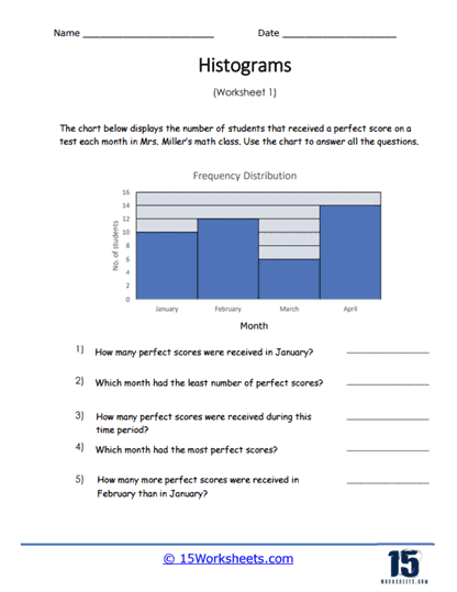
The chart displays the number of students that received a perfect score on a test each month. Use the chart to answer all the questions based on the data.
The worksheet provided is centered around the interpretation of a histogram, which is a type of bar graph representing frequency distribution. The histogram on the worksheet displays the number of students who received a perfect score on a math test in Mrs. Miller’s class for each month from January to April. Students are required to analyze the histogram and use it to answer questions related to the data presented, such as identifying the number of perfect scores in a given month, which month had the least or most perfect scores, and comparing the number of perfect scores between different months.
The purpose of this worksheet is to teach students how to read and extract information from histograms. It introduces them to the concept of frequency distribution in a graphical form, encouraging them to engage with the data to draw conclusions. Through the questions provided, students learn to compare quantities and identify trends over time. The exercise aims to enhance students’ abilities in data interpretation, critical thinking, and applying mathematical knowledge to real-world contexts.