Making a Camera Sales Histogram
Worksheet Description
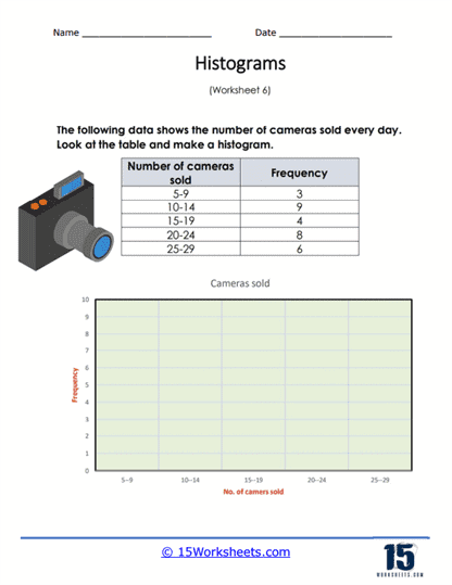
You are given a frequency chart to display the daily camera sales over the course of a month. Use the frequency table to create your histogram.
This worksheet provides a table with data on the number of cameras sold daily, categorized into frequency ranges. The table is divided into intervals representing the number of cameras sold, alongside the frequency of sales within those intervals. Students are required to use this data to construct a histogram, which is a type of bar chart that represents the frequency of data within certain ranges. The worksheet includes a blank axis for the histogram, with the horizontal axis already labeled with the number of cameras sold.
The worksheet is designed to teach students how to create a histogram from a frequency distribution table. It guides them in translating numerical data into a visual graph, which involves determining the scale for the axes and drawing bars that represent the frequency of each category. This activity helps students understand the concept of data representation and provides them with a visual understanding of how often different ranges of values occur. By completing the worksheet, students learn an essential skill in data analysis, which is the ability to graphically display and interpret data distributions.