Color Choices
Worksheet Description
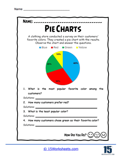
This worksheet presents a pie chart that displays the results of a survey conducted by a clothing store to find out their customers’ favorite colors. The chart is divided into four segments, representing the colors blue, red, green, and yellow, with each segment showing the percentage of customers who prefer each color. Students are asked to observe the chart and answer questions such as identifying the most popular and least popular colors, as well as calculating the number of customers who prefer specific colors like red and green. This activity combines visual data interpretation with practical problem-solving, using the familiar context of color preferences.
The worksheet is designed to teach students how to accurately interpret pie charts, focusing on understanding proportions and converting them into real numbers. By analyzing the pie chart, students learn to compare the sizes of the segments and understand what these percentages represent in a real-world context. The questions prompt students to apply their knowledge of percentages to solve practical problems, such as determining how many customers prefer a particular color. This exercise reinforces essential math skills, including fraction-to-percentage conversion, basic arithmetic, and the ability to draw meaningful conclusions from visual data, all within the context of an engaging and relatable topic-favorite colors.