TV Tastes
Worksheet Description
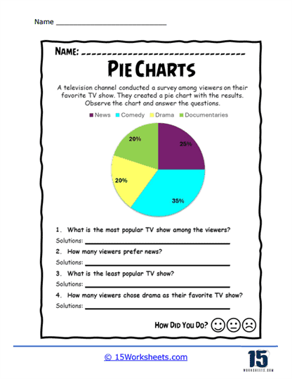
This worksheet presents a pie chart that displays the results of a survey conducted by a television channel, where viewers voted on their favorite types of TV shows. The pie chart is divided into four categories: News, Comedy, Drama, and Documentaries, each representing a different percentage of the total votes. Students are asked to observe the chart and answer questions related to the data, such as identifying the most popular TV show genre and calculating how many viewers prefer each category. This activity engages students by combining visual data interpretation with practical problem-solving.
The worksheet is designed to teach students how to accurately interpret pie charts, with a focus on understanding proportions and percentages. By analyzing the pie chart, students learn to identify which categories represent the largest or smallest portions of the whole and how these portions relate to real numbers when given additional information. The questions encourage students to apply their understanding of percentages to solve practical problems, such as determining the number of viewers who prefer each genre. This exercise also reinforces essential math skills like fraction-to-percentage conversion, basic arithmetic, and the ability to draw conclusions from visual data, all within the context of a familiar and engaging topic-television preferences.