Algebra and Circle Graphs
Worksheet Description
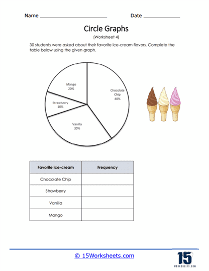
30 students were asked their favorite ice cream flavor. The circle graph reflects that data that was collected, and the percentages of the data are given. Convert those percentages to frequencies to help you better explain the data.
This worksheet features a pie chart that represents the favorite ice-cream flavors among 30 students. The flavors shown in the pie chart include chocolate, vanilla, strawberry, and mango, with each segment of the chart indicating the percentage of students who prefer that flavor. The task for the students is to complete a frequency table based on the information provided in the graph. The table lists the flavors chocolate chip, strawberry, vanilla, and mango, and students must fill in the frequency column according to the data from the pie chart.
The worksheet is designed to teach students how to translate information from a pie chart into a frequency table. This skill involves understanding percentages and converting them into actual numbers based on the given total. It also helps students develop an understanding of how data can be represented in different formats, both visually and in tabular form. By engaging with this activity, students enhance their ability to interpret graphical data and present it in a numerical context, which is a valuable skill in data analysis.