Three Chart Types
Worksheet Description
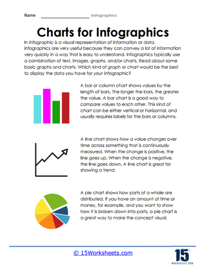
The “Charts for Infographics” worksheet is an instructional resource aimed at educating students on the use of different chart types to visually present data. The worksheet provides a succinct explanation of what an infographic is and its effectiveness in conveying complex information quickly and clearly. It introduces three main types of charts commonly used in infographics: bar or column charts, line charts, and pie charts. Each chart type is accompanied by a description and a graphic example, illustrating how it represents data visually.
Bar charts are explained as a means of comparing values, with the length of the bars corresponding to the value they represent. Line charts are described as tools for displaying trends over time, with the direction of the line indicating whether the trend is positive, negative, or neutral. Lastly, pie charts are presented as a way to show how different parts make up a whole. The worksheet encourages students to think critically about which type of chart would best display their data, promoting an understanding of how to match data types with appropriate visual representations. This exercise helps students develop the skills to create effective infographics that are informative and engaging.