A Healthy Diet
Worksheet Description
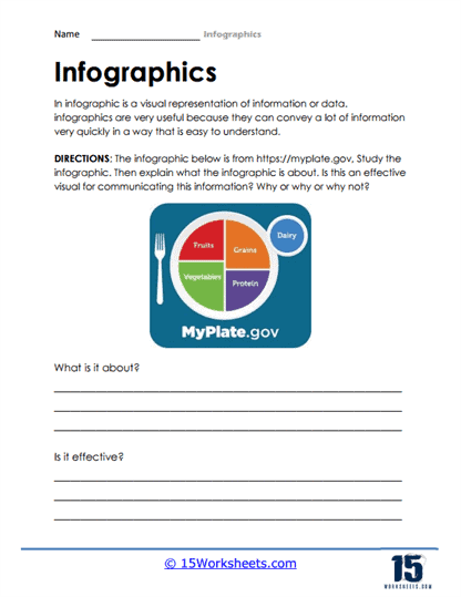
This worksheet introduces students to the concept of infographics as a tool for visual communication. At the top, it provides a brief description, explaining that infographics are effective because they can present complex information in a digestible, easy-to-understand format. To put this explanation into practice, the worksheet features an actual infographic from MyPlate.gov, a government website that provides nutritional guidelines. The included infographic is a visual representation of the MyPlate nutrition guide, depicting the recommended proportions of different food groups on a plate.
Beneath the infographic, the worksheet offers two questions to encourage critical engagement with the material. The first question asks students to explain what the infographic is about, prompting them to interpret the visual information and summarize the message it conveys about a balanced diet. The second question challenges students to assess the effectiveness of the infographic as a communication tool. They must consider whether the design and presentation clearly and efficiently communicate the key ideas about nutrition. This worksheet is not only an exercise in understanding health and nutrition but also a lesson in visual literacy, enabling students to analyze how information can be structured visually for clarity and impact.