John’s Weekly Allowance
Worksheet Description
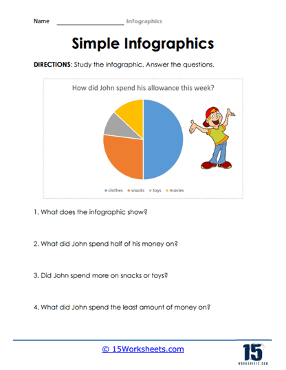
The “Simple Infographics” worksheet is a vibrant educational resource that introduces students to the basics of data interpretation through pie charts. The centerpiece of the worksheet is a colorful pie chart detailing how a child named John has allocated his weekly allowance among four categories: clothes, snacks, toys, and movies. Each segment of the chart is color-coded to correspond with the different categories, allowing for easy visual distinction. Accompanying the pie chart is an illustration of a boy, presumably John, celebrating with his hands in the air, which adds a playful element to the learning activity.
Beneath the pie chart, the worksheet poses a series of questions that challenge students to analyze the visual data. Questions range from identifying what the infographic shows to more specific inquiries about which category received the largest and smallest portions of John’s allowance. Through these questions, students practice critical thinking by interpreting the chart to understand John’s spending habits. This hands-on approach to learning helps students grasp the practical application of pie charts in everyday life, enhancing their mathematical literacy and decision-making skills. It’s an effective tool for making the abstract concept of data analysis tangible and engaging for young learners.