2019 Charitable Donations
Worksheet Description
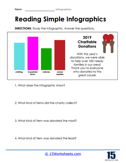
This educational worksheet titled “Reading Simple Infographics” is designed to teach students how to interpret and understand basic infographic elements. The sheet features a colorful bar graph representing different categories of items donated for a charitable cause in 2019, including clothing, household items, vehicles, and school supplies. The graph is coupled with a brief description that credits the donations for helping over 100 needy families and extends thanks to the contributors. This context provides the backdrop for the data visualization, which students are tasked to analyze.
The worksheet includes four questions that guide students through the process of extracting information from the infographic. The first question asks what the infographic shows, prompting students to summarize the data presented. The following questions are more specific, directing students’ attention to the types of items collected and the quantity of donations. Students are asked to identify which item was donated the most and the least, encouraging them to compare and contrast the data points. By answering these questions, students practice critical thinking skills and learn to draw conclusions from visual data representations. The worksheet is not only a tool for developing data literacy but also for reinforcing the importance of charitable giving and community support.